Colors influence our emotions and impact purchasing decisions. At The Webix, we apply this approach to help our clients leverage the meaning of colors to strengthen their marketing strategy. Indeed, we observe that a deep understanding of color psychology and theory not only improves brand identity but also enhances consumer engagement and decision-making in digital marketing. We are convinced that mastering these techniques can transform your visual strategies and effectively boost your market impact.In this article, we guide you through the meaning of colors, their role in marketing, and provide practical advice to optimize your communication.
In this article, we guide you through the meaning of colors, their role in marketing, and provide practical advice to optimize your communication.
1. The meaning of red in marketing
Red is an intense and captivating color. It is often associated with passion, energy, and urgency. Thanks to its immediate visual impact, it grabs attention and stimulates quick actions. Indeed, in color symbolism, red generates strong emotions. These range from excitement and warmth to impulsiveness and danger. This duality allows it to be used in various contexts, depending on the goal.
Moreover, this color is perceived as powerful and dynamic. This makes it an excellent choice for brands wanting to make an impression and provoke an immediate reaction. Its strategic use goes beyond aesthetics. It also plays a key role in influencing consumer behaviors and decisions. Thus, whether used to stimulate a purchase, strengthen a brand identity, or evoke urgency, red remains essential in marketing.
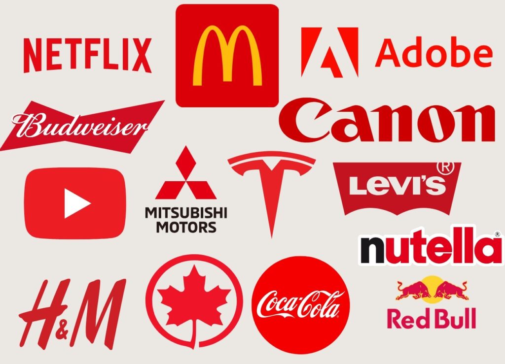
Famous brands : Coca-Cola, Red Bull, YouTube, Netflix, and Levi’s use red to strengthen a dynamic, bold, and stimulating image.
Thus, in the meaning of colors, red stands out as the color of choice for businesses wanting to grab attention and provoke an immediate reaction in consumers. That’s why iconic brands like Coca-Cola and Red Bull use it to reflect an energetic and lively image, while YouTube and Netflix make it a symbol of engagement and passion for entertainment. Finally, thanks to its ability to evoke urgency, power, and emotion, red is an essential choice for brands that want to leave a lasting impression.
1.1 Marketing usage
In marketing, red is often used to :
- Create a sense of urgency : Commonly used in promotions, flash sales, and call-to-action buttons, it encourages quick decision-making
- Stimulate appetite : Used by many food brands, it is recognized for arousing hunger and creating a sense of indulgence.
- Express passion and emotion : Associated with power and intensity, red is ideal for brands that want to embody strong energy and a bold character.
2. The meaning of blue in marketing
Blue is a calming and timeless color. It is often associated with trust, serenity, and reliability. Unlike warmer colors like red or orange, blue creates a sense of calm and professionalism. That’s why it is favored in the technology, finance, and communication sectors.
In color symbolism, blue is also linked to intelligence and innovation. This makes it an ideal choice for brands aiming to project an image of stability and modernity. Its ability to reassure and structure consumers' visual perception makes it essential in many fields.
Famous brands : Facebook, Twitter, IBM, Samsung, and Ford use blue to embody trust, technology, and stability.
Thus, blue in the meaning of colors stands as an ideal color for companies that want to establish a lasting relationship with their clients while strengthening their credibility. That’s why brands like IBM and Samsung use it to represent innovation and technology. While Facebook and Twitter use it to encourage accessibility and connection between individuals. Finally, due to its ability to evoke both serenity and expertise, blue is an excellent choice for brands seeking to balance professionalism and modernity.

2.1 Marketing usage
In marketing, blue is often used to :
- Inspire trust and credibility : Widely used in finance, insurance, and technology companies. Blue reassures and enhances the perceived reliability of brands.
- Create a sense of calm and security : Used by health brands and social media platforms, it helps establish a soothing and accessible environment for consumers.
- Evoke professionalism and innovation : Strongly used by B2B companies and large corporations, blue is ideal for projecting a serious and modern image.
3. The meaning of green in marketing
Green is a naturally soothing and refreshing color. It is often associated with nature, health, and growth. Thanks to its positive connotations, it is widely used in marketing to convey messages related to well-being, sustainability, and harmony. Indeed, green evokes emotions ranging from serenity and balance to vitality and optimism. This versatility allows it to be used in various sectors, depending on the image the brand wants to project.
Moreover, this color is recognized for its reassuring effect and direct link to the environment. That’s why it is frequently chosen by companies wanting to reinforce their ecological commitment or highlight natural and healthy products. Its strategic use extends beyond the sustainable development sector to industries like health, well-being, and even finance, where it symbolizes prosperity and stability.
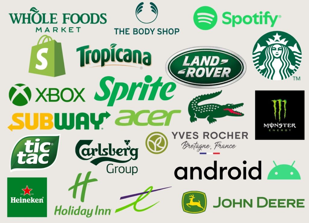
Famous brands : Starbucks, Spotify, Whole Foods, Land Rover, and Tropicana use green to reinforce their image of nature. Also for freshness, and environmental responsibility.
Thus, green in the meaning of colors stands as an ideal color for companies looking to inspire trust and reflect values of sustainability and well-being. That’s why brands like Whole Foods and The Body Shop use it to emphasize their commitment to natural and responsible products. While Starbucks and Tropicana use it to highlight the freshness and authenticity of their offerings. Finally, due to its association with prosperity and balance, green is an excellent choice for brands seeking to project a positive and reassuring image.
3.1 Marketing usage
In marketing, green is often used to :
- Represent nature and ecology : Frequently employed by organic and environmental brands, it conveys an image of sustainability and responsibility.
- Evoke health and well-being : Used by companies in the nutrition, healthcare, and sports sectors, it embodies balance and vitality.
- Suggest growth and prosperity : Often present in the financial sector, it is commonly associated with success and abundance.
4. The meaning of yellow in marketing
Yellow is a bright and dynamic color, often associated with optimism, joy, and energy. Thanks to its high visibility, it is frequently used in marketing to capture attention and evoke positive emotions. Indeed, yellow evokes feelings ranging from warmth and happiness to creativity and spontaneity. Its ability to attract the eye and stimulate the mind makes it an ideal color for brands wishing to project a dynamic and engaging image.
Moreover, this color is recognized for its stimulating effect on the intellect and its ability to inspire curiosity and enthusiasm. That’s why it is often chosen by companies wishing to evoke youth, innovation, or accessibility. Its strategic use is not limited to products intended for children or leisure. But also extends to sectors like commerce and food, where it helps create a welcoming and energizing atmosphere.
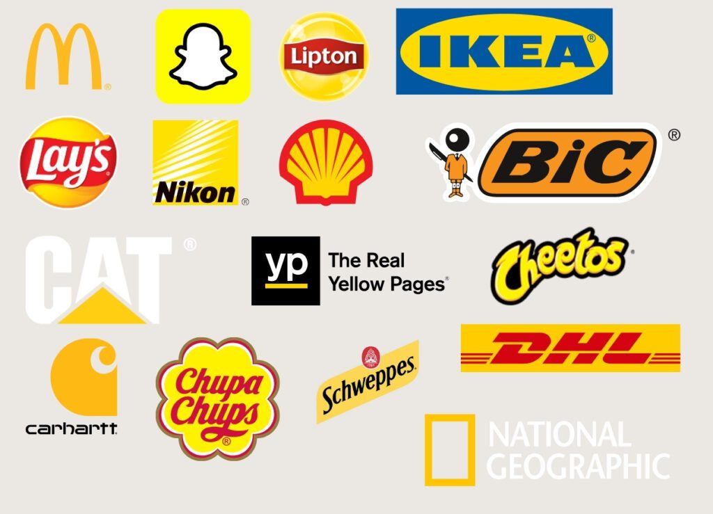
Famous brands : McDonald’s, Snapchat, Ikea, Shell, and Ferrari use yellow to convey an image of energy, enthusiasm, and positivity.
Thus, yellow emerges as an ideal color for businesses that want to energize their brand image and evoke positive emotions. That’s why brands like McDonald’s and Snapchat use it to reflect a playful and accessible atmosphere, while Ikea and Shell use it to symbolize innovation and speed. Finally, yellow grabs attention and stimulates creativity. Therefore, it’s an excellent choice for brands aiming to make an impression. Moreover, it also inspires optimism.
4.1 Marketing usage
In marketing, yellow is often used to :
- Attract attention Due to its high visibility, it is used to highlight key elements like promotions. As well as billboards and call-to-action buttons.
- Create a warm and dynamic ambiance : Ideal for brands looking to convey a joyful and friendly image. It is commonly used in the entertainment and food industries.
- Stimulate creativity and innovation : Often associated with inventive thinking and learning. It is used by companies that want to inspire reflection and imagination.
5. The meaning of orange in marketing
Orange is a vibrant and dynamic color. It is often associated with energy, enthusiasm, and creativity. Thanks to its blend of the warmth of red and the positivity of yellow, it grabs attention. Moreover, it inspires a sense of friendliness and accessibility. Orange evokes emotions ranging from excitement to confidence and fun. Due to this ability to convey an engaging message, it becomes a popular choice. Thus, brands use it to stand out with a bold and innovative identity.
Moreover, this color stimulates decision-making and is associated with optimism and action. Therefore, it is frequently chosen by companies wanting to encourage interaction. It also encourages exploration and strengthens the dynamic image of brands. Its strategic use goes beyond the entertainment and communication industries. In fact, it also extends to the technology, commerce, and sports sectors. In these fields, it embodies vitality and movement.
Famous brands : Fanta, Nickelodeon, Amazon (in its logo), Harley-Davidson, and SoundCloud use orange to reflect an energetic, engaging, and bold image.
Thus, orange emerges as an ideal color for businesses that want to convey a dynamic and optimistic identity. That’s why brands like Fanta and Nickelodeon use it to embody joy and fun. Meanwhile, Amazon and Harley-Davidson make it a symbol of movement and responsiveness. Finally, orange inspires action and grabs attention. Therefore, it is an excellent choice for brands. They aim to establish a strong and positive connection with their audience.
5.1 Marketing usage
In marketing, orange is often used to :
- Encourage action and engagement : Used in call-to-action buttons and promotions, it grabs attention without being as aggressive as red.
- Represent friendliness and accessibility : Used by brands wishing to convey a friendly and dynamic image, often in commerce and entertainment.
- Stimulate creativity and innovation : Chosen by companies and startups wishing to inspire boldness, modernity, and originality.
6. The meaning of purple in marketing
Purple is a color rich in symbolism, often associated with creativity, luxury, and mystery. Due to its historical link with royalty and spirituality, it is used in marketing to project an image of elegance, originality, and sophistication. Indeed, purple evokes emotions ranging from refinement and wisdom to imagination and innovation. This duality makes it a popular choice for brands wishing to combine prestige and modernity.
Moreover, this color is recognized for its inspiring effect and its association with intuition and exclusivity. That’s why it is frequently chosen by companies wanting to stand out by offering a distinctive and high-end image. Its strategic use extends beyond luxury products to industries like entertainment, technology, and well-being, where it embodies both creativity and transformation.
Famous brands : Cadbury, Hallmark, Yahoo, Syfy, and Twitch use purple to project an image of creativity, prestige, and distinction.
Thus, purple expresses a sophisticated and unique visual identity. That’s why brands like Cadbury and Hallmark use it to highlight their quality and tradition. Moreover, Twitch and SyFy make it a symbol of innovation and boldness in the entertainment world. Finally, purple combines mystery and elegance. Therefore, it is an excellent choice for brands seeking to inspire both imagination and distinction.
6.1. Marketing usage
In marketing, purple is often used to :
- Represent luxury and exclusivity : Widely used by high-end brands, it conveys an image of sophistication and elegance.
- Evoke creativity and originality : Used in the entertainment and technology fields, it strengthens perceptions of innovation and imagination.
- Embody spirituality and intuition : Commonly used in the wellness and personal development industry, it symbolizes transformation and deep reflection.
7. The meaning of black in marketing
Black is a powerful and timeless color. It is often associated with elegance, luxury, and mystery. Thanks to its sobriety and intensity, it projects a sophisticated, modern, and exclusive image. Indeed, black evokes emotions ranging from prestige and authority to simplicity and minimalism. This duality allows it to be adopted by brands from various sectors. They aim to reflect a high-end image or embody a strong and refined identity.
Moreover, black is recognized for its striking visual effect. It is also associated with rigor and distinction. That’s why it is frequently chosen by companies wanting to assert their premium positioning. It strengthens the impact of their visual identity. Its strategic use is not limited to the luxury and fashion industries. In fact, it also extends to the technology, automotive, and design sectors. In these fields, it symbolizes modernity and sophistication.
Famous brands : Chanel, Adidas, Apple, Sony, and Louis Vuitton use black to convey an image of sophistication, innovation, and timelessness.
Thus, black stands as an ideal color for companies wishing to assert their prestige and uniqueness. That’s why brands like Chanel and Louis Vuitton use it to reflect discreet, refined luxury. While Apple and Sony make it a symbol of modernity and advanced technology. Finally, due to its ability to embody both simplicity and excellence, black is an excellent choice for brands looking to impose a strong and lasting identity.

7.1. Marketing usage
In marketing, black is often used to :
- Represent elegance and luxury : Highly favored by high-end brands, it embodies exclusivity and refinement.
- Assert a strong and timeless identity : Used by brands wishing to project a sober but impactful image, it enhances perceptions of quality and seriousness.
- Create contrast and intensity : Often combined with bright or metallic colors, it helps structure a design and draw attention to specific elements.
8. The meaning of brown in marketing
Brown is a warm and authentic color. It is often associated with nature, strength, and reliability. Thanks to its connection to the earth and raw materials, it evokes stability, tradition, and authenticity. Indeed, brown conveys emotions ranging from solidity and comfort to rustic elegance and simplicity. This ability to inspire trust and durability makes it an ideal color for brands. They aim to project a natural and timeless image.
Moreover, brown is recognized for its reassuring effect. It is also associated with the values of craftsmanship and sustainability. That’s why it is frequently chosen by companies wanting to embody reliability, closeness, and a return to roots. Its strategic use is not limited to the wood and handmade product sectors. It extends to the food, travel, and fashion industries. In these fields, it highlights the authenticity and quality of products.
Famous brands : UPS, Timberland, Hershey’s, and M&M’s (for certain variants) use brown to reinforce their image of strength, authenticity, and reliability.
Thus, brown emerges as an ideal color for companies. They want to convey an identity focused on tradition and trust. That’s why brands like Timberland and UPS use it to emphasize their commitment to reliability and strength. Meanwhile, Hershey’s and M&M’s make it a symbol of comfort and indulgence. Finally, thanks to its ability to embody both simplicity and natural elegance, brown is an excellent choice for brands. They seek to inspire warmth and credibility.
8.1. Marketing usage
In marketing, brown is often used to :
- Evoke strength and reliability : Commonly used by brands wanting to reflect an image of solidity and durability.
- Represent authenticity and nature : Used by artisanal and eco-friendly companies, it highlights values of tradition and simplicity.
- Create a sense of warmth and comfort : Associated with wood and natural elements, it adds a touch of rustic elegance and friendliness.
9. The meaning of pink in marketing
Pink is a soft and delicate color. It is often associated with femininity, tenderness, and romance. Unlike more intense colors like red, pink inspires a sense of softness, innocence, and modernity. This makes it a popular choice in the fashion, beauty, and lifestyle industries.
In color symbolism, pink is also linked to creativity and accessibility. This allows it to project a young and dynamic image.
Famous brands : Victoria’s Secret, Barbie, T-Mobile, and Cosmopolitan use pink to reflect an elegant, accessible, and dynamic image.
Pink is an ideal color for businesses looking to convey a young, trendy, and inclusive visual identity. Brands like Barbie and Victoria’s Secret use it to embody femininity and fashion. Meanwhile, T-Mobile and Lyft adopt it for a bolder and more modern approach. This color, capable of evoking both softness and innovation, is an excellent choice for brands. They want to stand out with an original and vibrant identity.
9.1 Marketing usage
In marketing, pink is often used to :
- Represent femininity and elegance : Widely used in fashion, luxury, and cosmetics industries, pink conveys a sophisticated and refined image.
- Create a soft and caring atmosphere : Often chosen by brands wishing to be perceived as warm and accessible.
- Evoke modernity and innovation : Used by some startups and tech brands, pink gives an impression of boldness and originality.
10. Colors in digital marketing
10.1 Impact on branding
Colors and the meaning of colors reinforce brand identity. For example, Coca-Cola and Facebook use red and blue. They create a memorable image and differentiate your brand. This establishes a strong connection with the audience.
10.2 Website optimization
Colors play a key role on websites. They enhance user experience and guide the eye to important information. Furthermore, a well-chosen color palette increases conversion rates. Thus, colorful design must be well thought out.
10.3 Ads and campaigns
The meaning of colors directly influences the effectiveness of ads. For example, color contrast increases the visibility of banners and enhances their visual impact. Moreover, well-designed campaigns incorporating colors suited to their message quickly attract consumers' attention. Additionally, consistent use of colors, in line with their meaning and the brand’s identity, strengthens ad credibility and promotes visual recognition.
11. Tips for incorporating the meaning of colors into your marketing strategy
11.1 Brand analysis
First, identify the image you want to convey. Then, analyze your brand’s values and message. Choose colors that align with these elements. This way, you will establish a strong identity.
11.2 Choosing color palettes
Opt for a cohesive palette considering the meaning of colors. For example, combine a dominant color with secondary shades that reinforce the message you wish to communicate. Use online tools to test your combinations and ensure they match the emotion or brand image you're aiming for. Balancing harmony and contrast is important to ensure an impactful and cohesive visual identity.
11.3 Testing and adjusting
Test your choices with your audience. Conduct surveys and analyze feedback. Adjust the palettes if necessary. An iterative approach guarantees the optimization of your strategy.
11.4 Integrating into overall design
Integrate your colors across all communication channels. Apply them on your website, in ads, and on social media. Ensure visual consistency to strengthen your brand image.
Towards colorful and effective communication
In summary, the meaning of colors is a powerful lever in marketing. Each hue influences emotions, guides behavior, and strengthens brand identity. With color psychology and theory, you can create impactful visuals and adapt your strategies to current trends. By applying these tips, you can optimize your communication and improve your results.
At The Webix, our team of digital marketing is available to help you integrate these techniques. We assist you in selecting colors that will strengthen your message and optimize your market impact.


